As we make our way through this series we’re seeing parts of the application slowly coming together. We’ve got a very basic front end, an API, a database, and user identity management. In this post we’ll look at making the front end more functional, improving the look and feel, and fleshing out the API to support the full range of CRUD operations on our todo list database.
Front End UI Library
I don’t have a huge amount of front end development experience, the little I do have coming mostly from hobby projects I work on outside of work. So in order to try and speed things up, I began looking for a component library. I figured I could get something half-decent looking up and running quite quickly this way. After a quick search online to see what was popular I decided to use Vuetify. Vuetify’s own website describes it as “a no design skills required Open Source UI Library with beautifully handcrafted Vue Components.” It sounds like just the thing for me.
Logo Design
We’re going to need a logo for this project and I’m not much of a graphic designer, but as we’re now living in the age of AI and copilots, I decided to see what I could get AI to produce for me. I popped over to Bing chat and asked it to “create a logo for a todo list application”. When Bing chat is generating images for you it will produce 4 different images, all variations on the prompt that you gave it. Of the 4 that Bing generated for me, I selected this one.
![]()
I chose this logo partly because I just liked the design, but also because I liked the colours being used and thought it would make a good colour scheme for the app.
The logo will need to be used in a few different places and removing the background will make it easier to work it. To do this I went over to removebg, which made light work of it. It removed the background and in seconds I’d downloaded a new, clean, copy of the image.
Favicon Generation
One of the places I need to use the logo is the favicon for the site. It turns out that generating a favicon is a far more involved process than I could have ever imagined and led me down a rabbit hole which ended with this fantastic post by Evil Martians that explain in quite some depth how we got to where we are today with favicons. Luckily, there are various sites that will make light work of this and keep it nice and simple.
To quickly generate a favicon I went to favicon.io. I uploaded my new, clean, background-less version of the logo and it quickly generated multiple versions of the logo in differing sizes.
- android-chrome-192x192.png
- android-chrome-512x512.png
- apple-touch-icon.png
- favicon-16x16.png
- favicon-32x32.png
- favicon.ico
- site.webmanifest
Picking a Colour Scheme
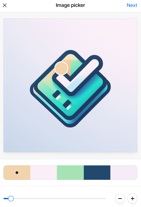
A really useful and powerful tool for generating colour schemes is Coolors. Coolors offers a few different tools for generating colour schemes, but the one most useful for me in this scenario was the ability to sample a colour palette from an image. I uploaded the logo that Bing had generated for me, moved the selector around the image a few times until I had a palette I liked.
Using the colours from the palette I could build a custom theme in Vuetify.
|
|
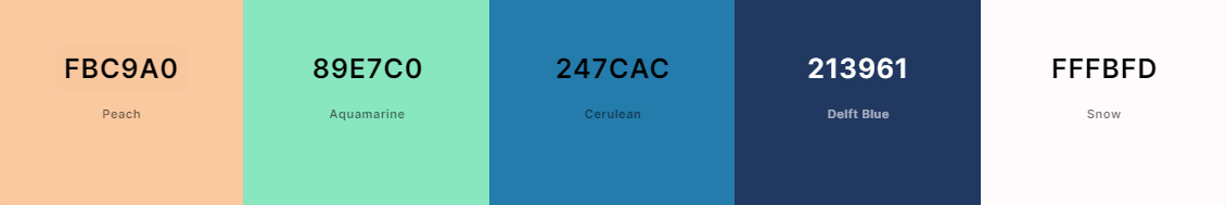
In the end I didn’t use ‘Delft Blue’ because of Vuetify’s ‘color variations’ feature it offers when defining custom themes. This feature will create lighter and darker variations of a specific colour. In my case I’ve configured 3 lighter and darker shades of the primary and secondary colours.
|
|
Being able to produce darker shades of the primary colour (Cerulean) meant the darker blue generated by Coolors wasn’t necessary.
UI Development
With all of this in place I began putting together the layout of the application starting with a landing page for unauthenticated (aka anonymous) users.
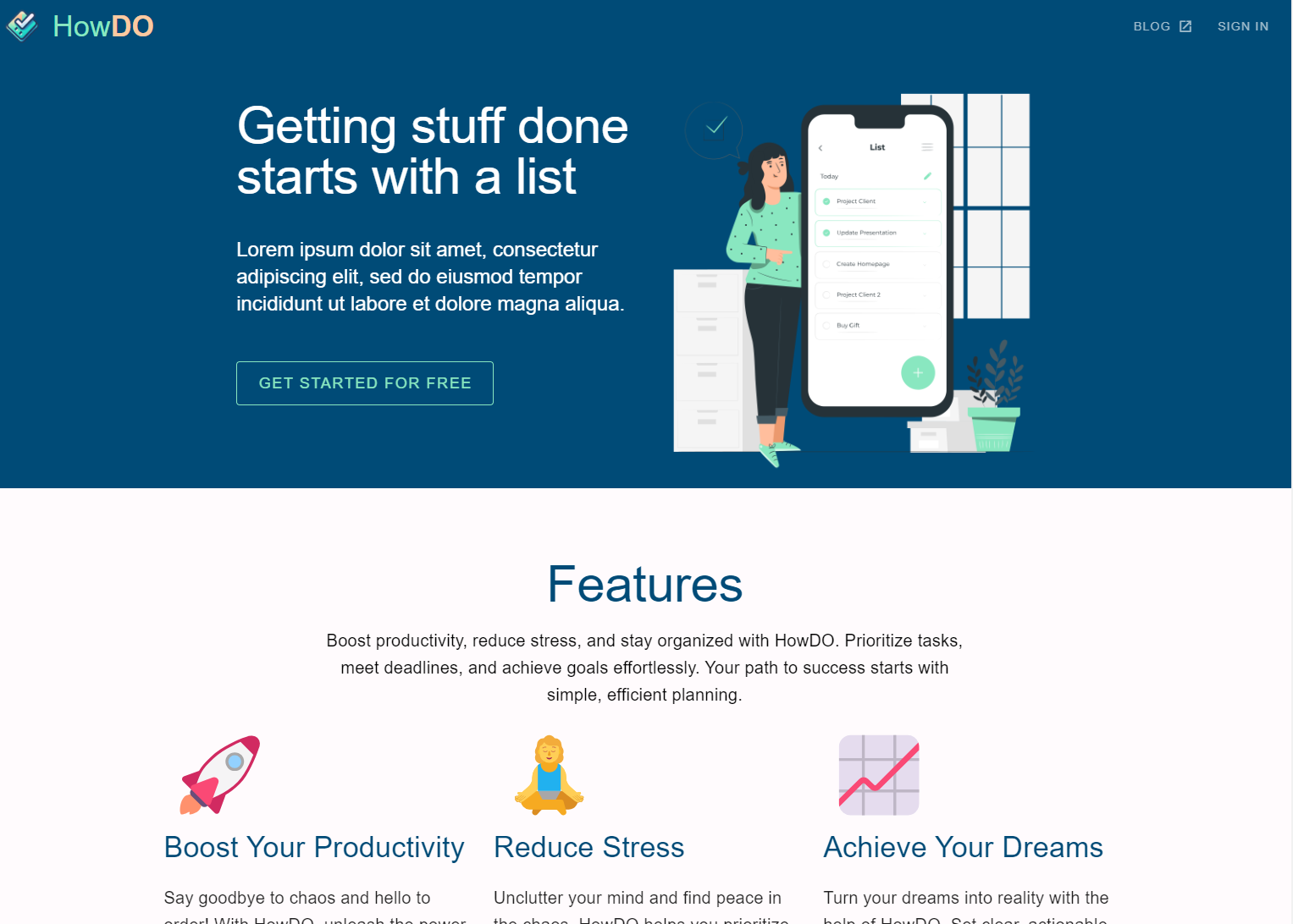
Once a user has signed in, going through the sign in user flow handled by Azure AD B2C, they’re presented with their todo list. They can add new items, edit existing items or delete them.
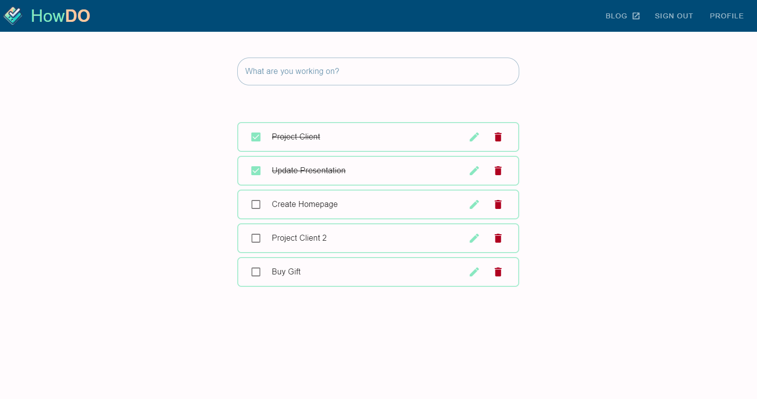
As the user is now logged in, the menu items in the app bar across the top of the page have been updated accordingly. The app now offers the user the ability to sign out or to edit their profile. Both of these links invoke user flows in Azure AD B2C.
Invoking the sign out user flow, does exactly what you’d expect, it ends the user’s session and returns them back to the original landing page as they are now an anonymous, unauthenticated user. Invoking the edit profile user flow takes the user to a page that allows them to edit their details. The exact fields they can edit are controlled by the user flow definition in Azure AD B2C, that we looked at in an earlier post on adding authentication.
The problem we have now is that the app is taking on a brand, a certain look-and-feel, but when we’re redirected to the user flows for sign in and profile editing, we’re presented with a page based on a template from Microsoft.
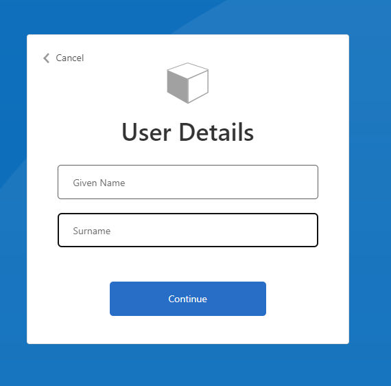
It’s quite obvious that we’ve been redirected away from the app. But fret not, we can fix this.
Conclusion
The application is coming really coming together now. We’ve got an application a user can sign up to, log in to and begin managing a basic todo list. As the site has developed it’s own distinct look-and-feel there are some aspects where Azure services are showing through and we can do better to try to hide those to improve the experience of the user.